Mio Performance UX
An ecosystem of heart rate workout devices required a companion app that placed the focus on heart rate training and high-performance usability
PLANNING, PERFORMANCE TRACKING AND FEEDBACK
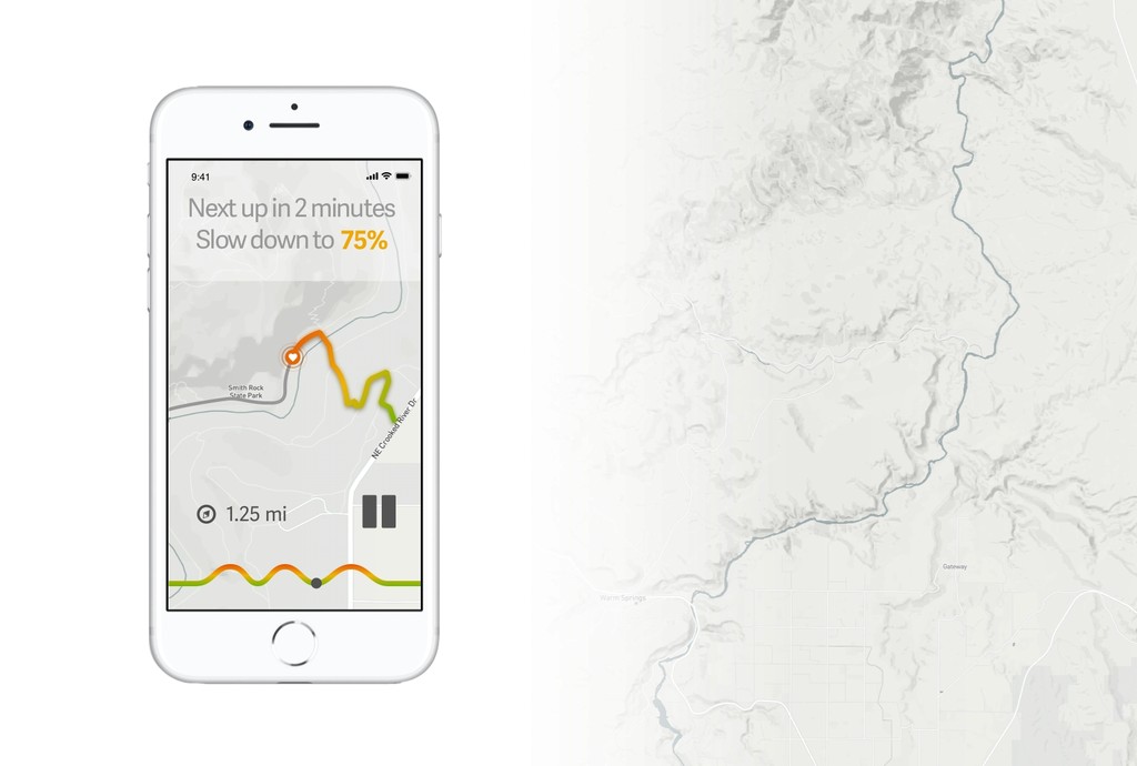
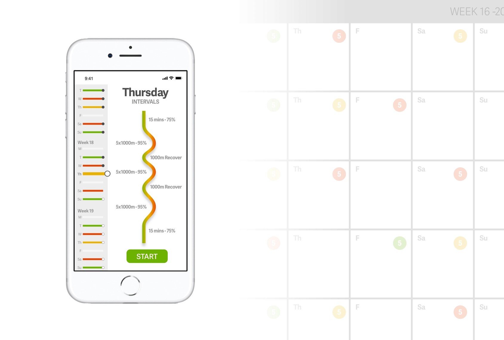
In-app planning, tracking and feedback tools were designed to help runners create ideal training plans and attain performance levels for 5k, 10k, half-marathon, marathon and ultra-marathon training.
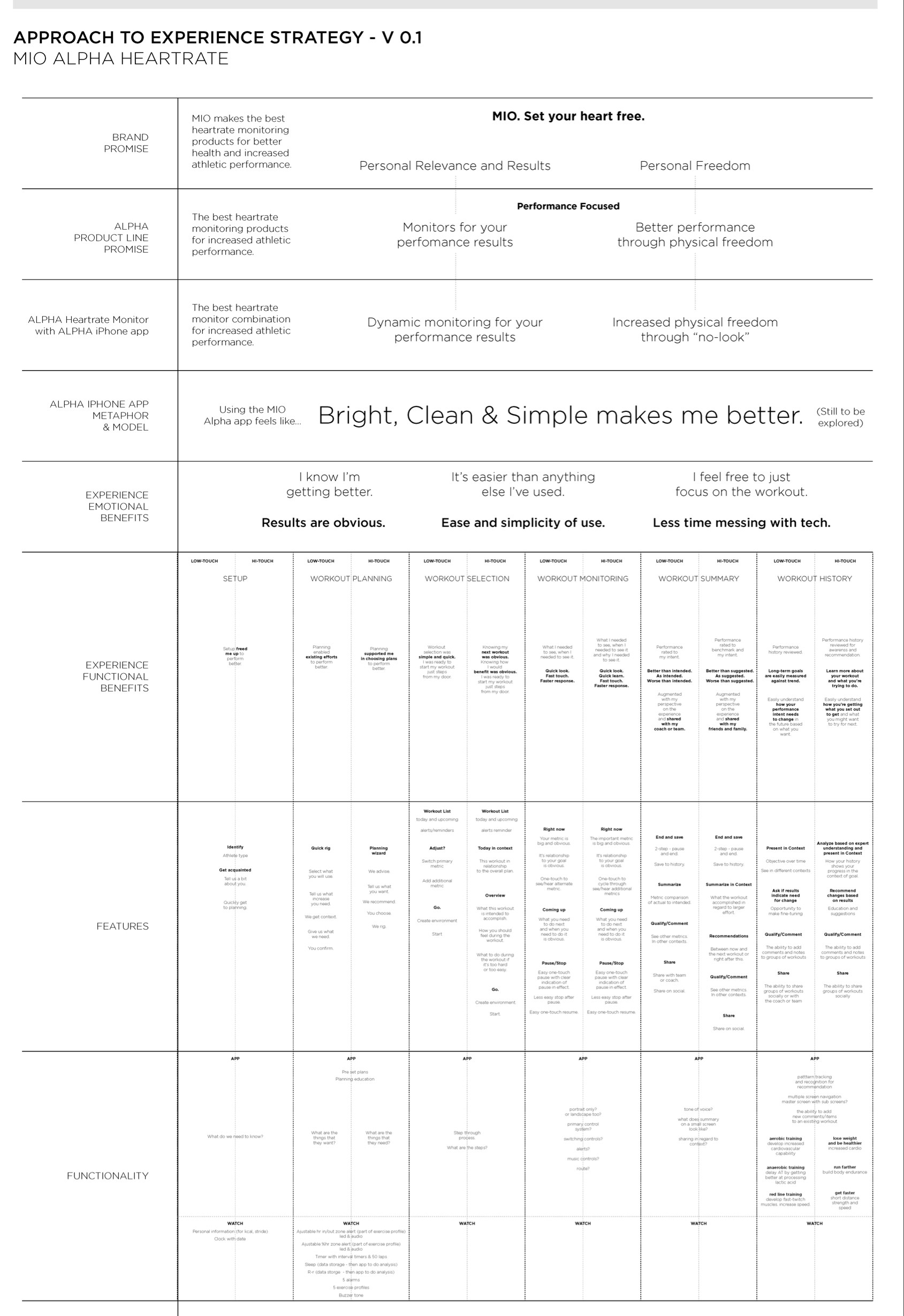
UNDERSTANDING AND ARTICULATING THE RELATIONSHIP BETWEEN FEATURES AND BENEFIT
By using brand, product and feature benefit ladders, we were able to articulate and then connect the prioritized functions within the product to the desired emotional and functional benefits we sought for superior product and brand experiences.
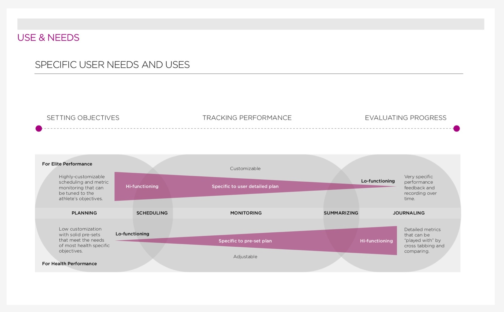
INTEGRATING TWO DISTINCT USE SCENARIOS IN ONE PRODUCT EXPERIENCE
Our core benefits of setting objectives, tracking performance, and evaluating progress, needed to accommodate the distinctly different priorities placed on each of those without a resulting compromise for any of them. To do this we made each interaction feel useful and complete with either low-volume or high-volume content.
EXPLORATION OF VISUAL AND BEHAVIORAL LANGUAGES
As we explored user benefit and feature prioritization, we also began work on the interaction models, gestures and visual language that would be prototyped to go through several rounds of user feedback.
Visual Design Inspiration
Visual design mood boards alongside Mio’s high-end wrist-based heart rate devices
Business Outcome
This project led to Mio being selected for integration into all of the adidas miCoach business unit.


